Rebranding
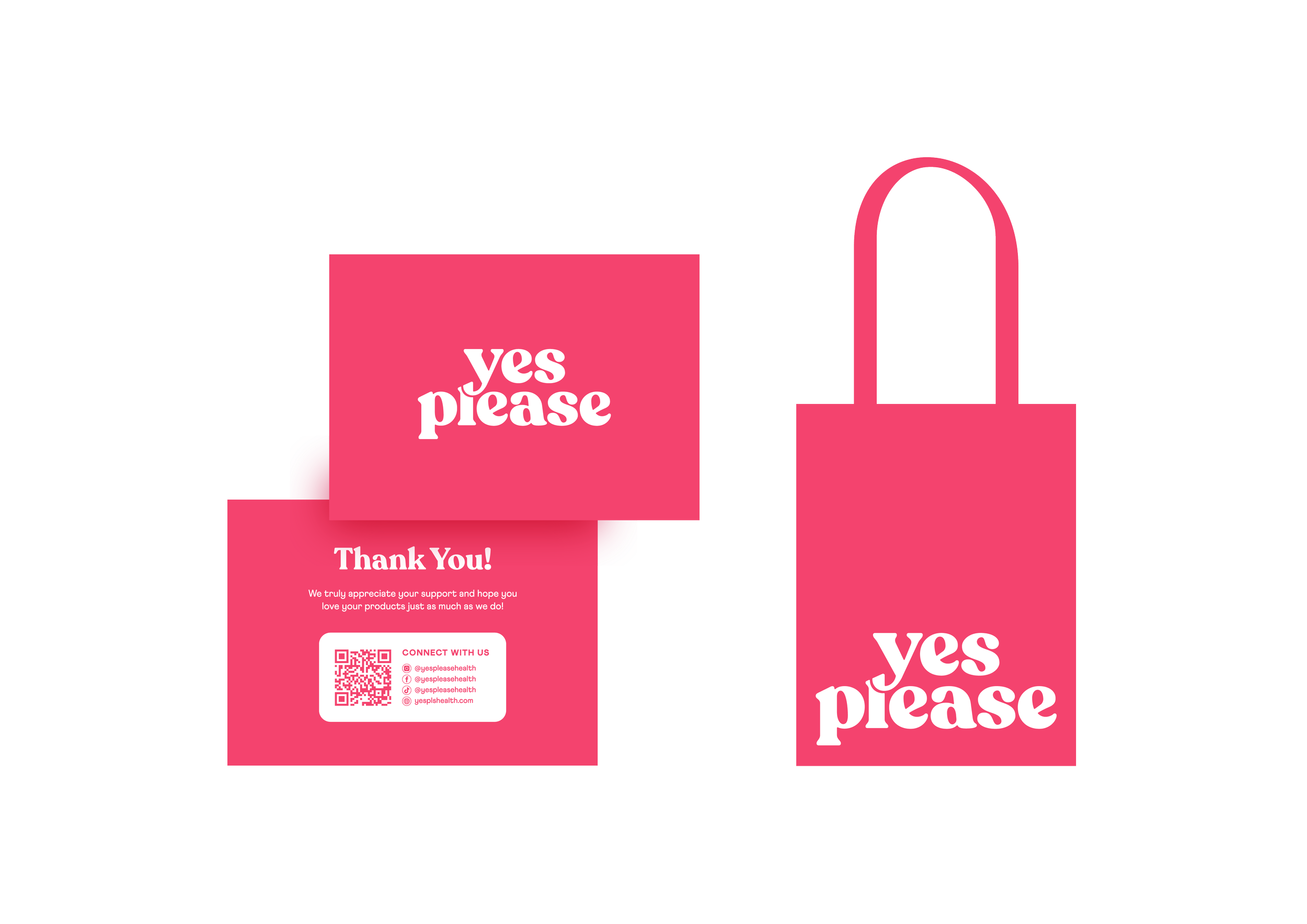
Visual Identity
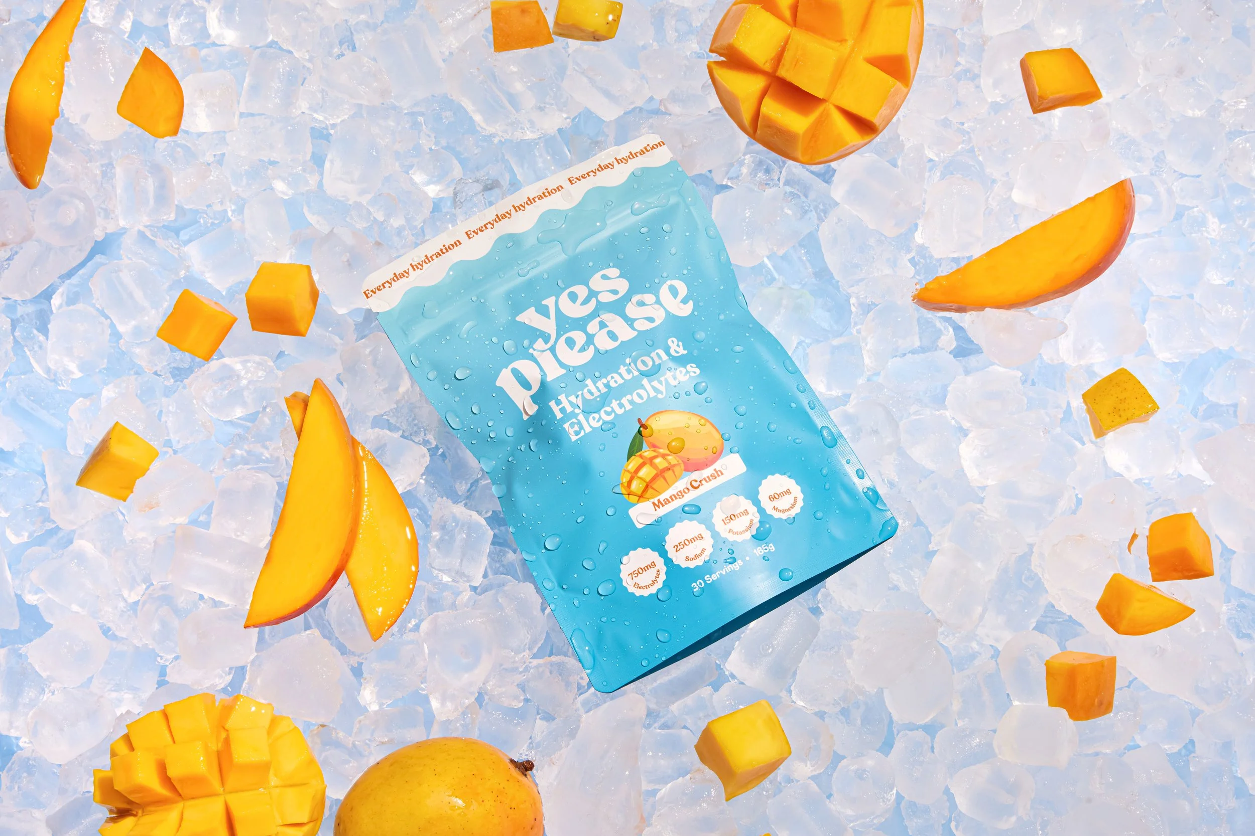
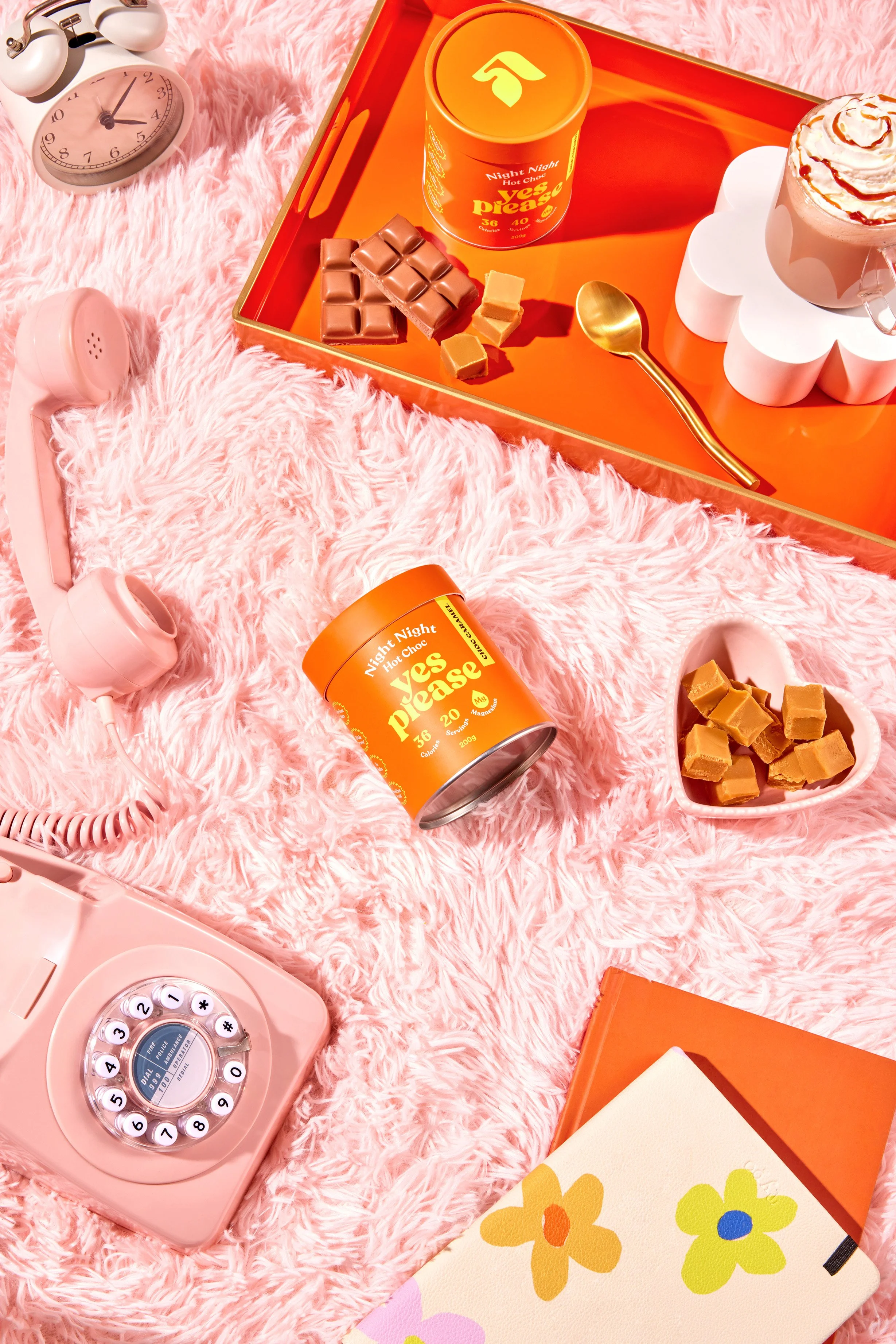
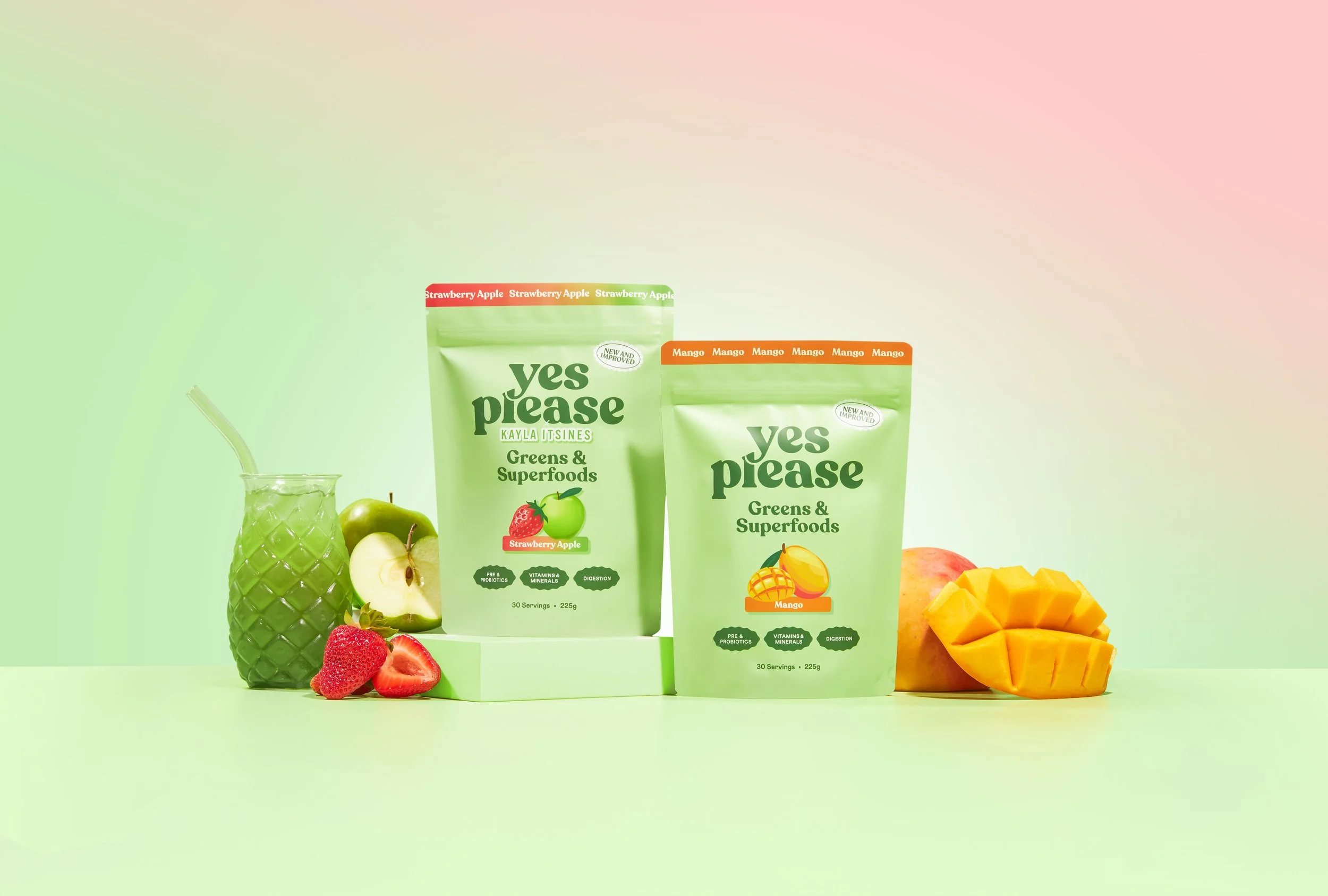
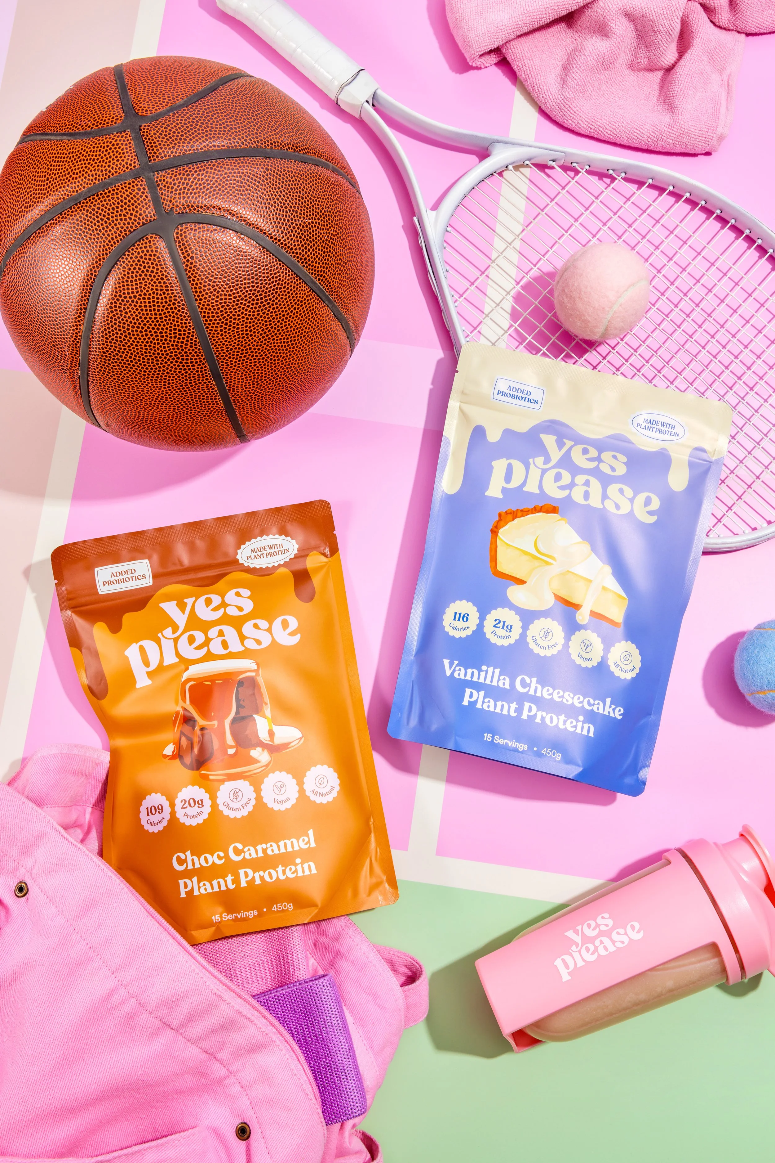
Packaging
Campaign Roll Out
-
Graphic Design: Alana Caporella
Photography: Florence James Collective

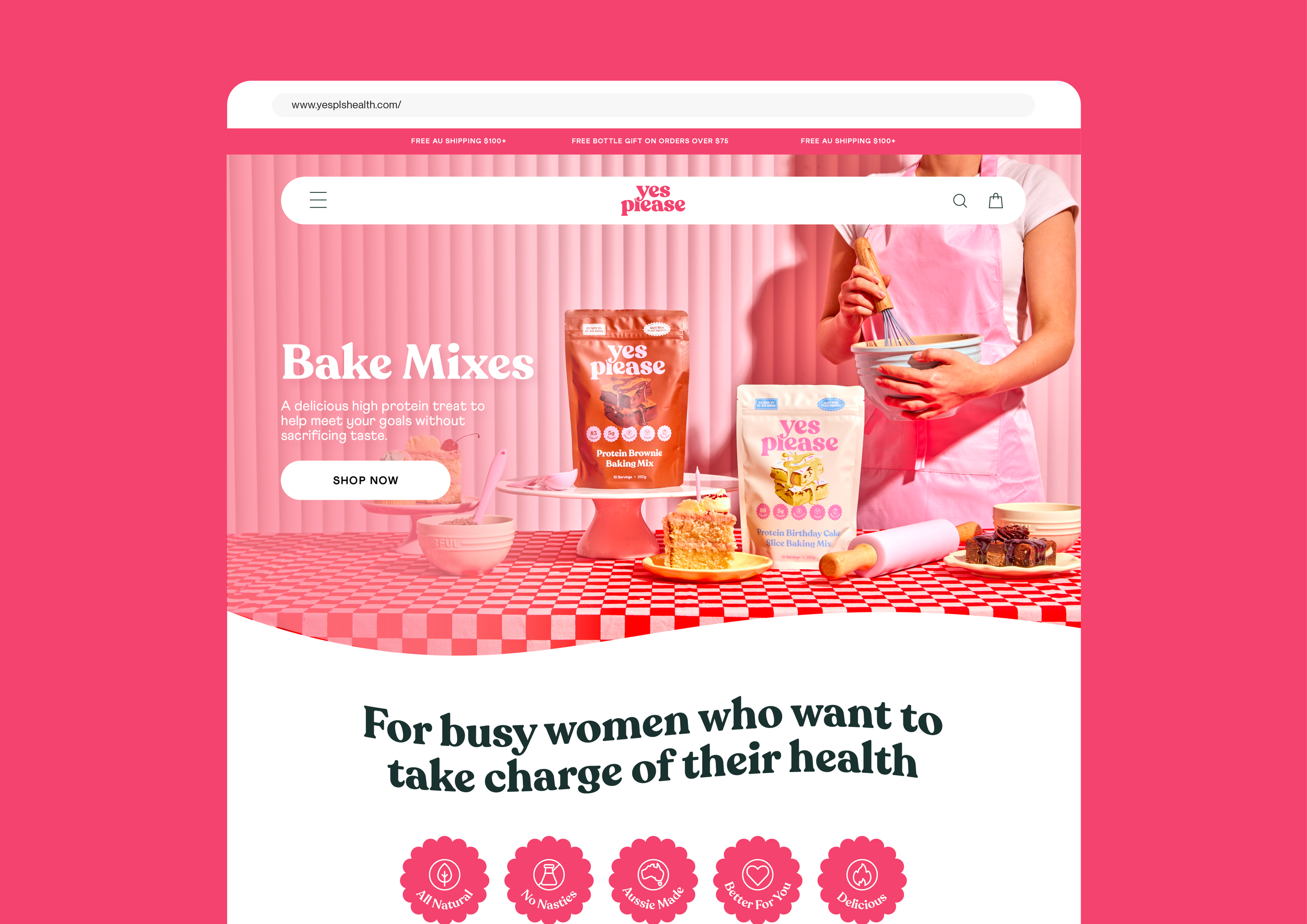
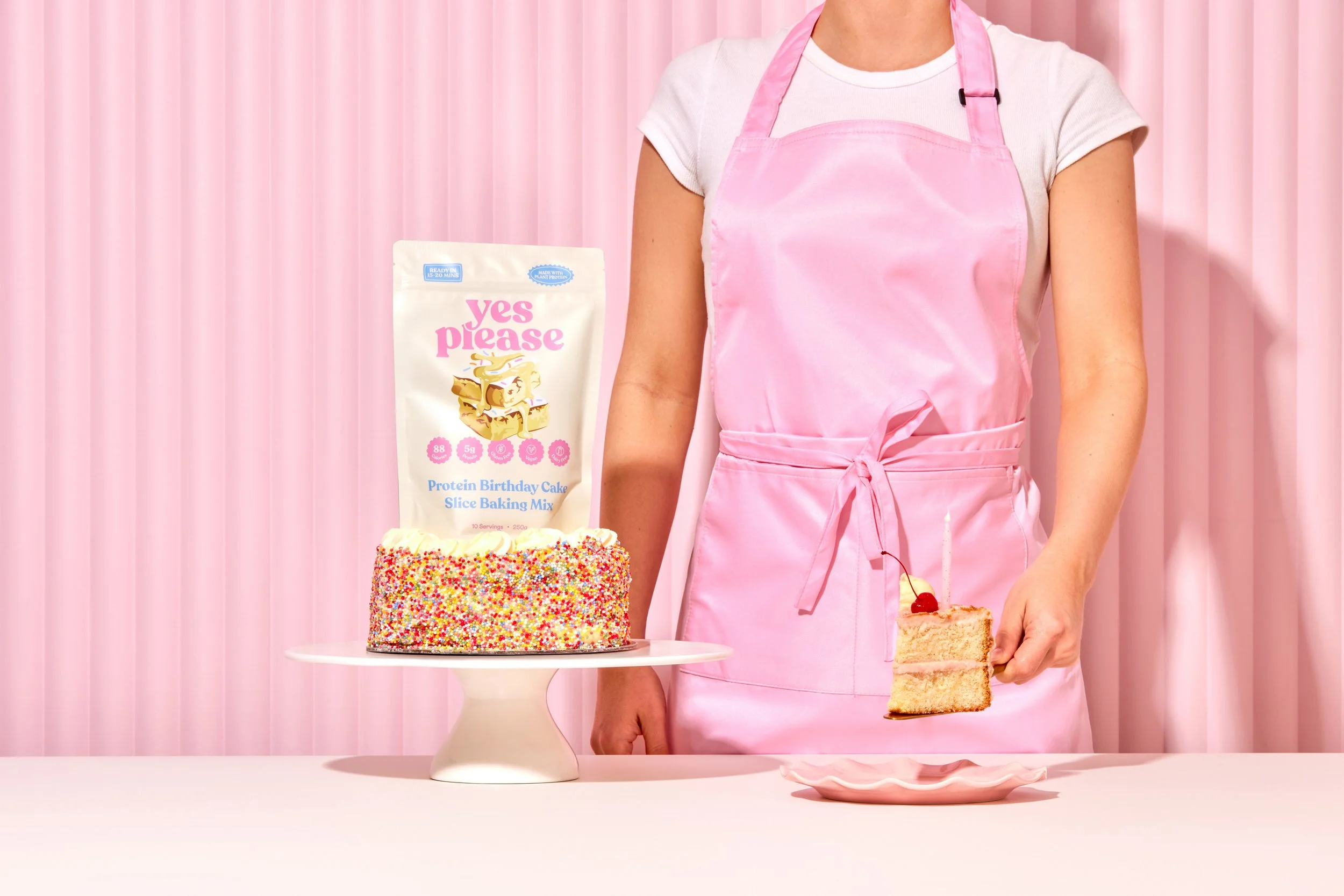
Making supplements fun and approachable since 2021.
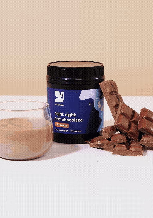
Yes Please launched with their much-loved Night Night Hot Chocolates before expanding their product range. We identified an opportunity within the previous branding — it lacked strong visual impact and clear brand recognition.
Known for creating delicious recipes, the founders place flavour at the heart of everything they do. Our goal was to ensure the product experience reflected this core brand value: deliciousness.
My approach to the new logo was to create a stronger impact - particularly in the typeface choice. I found the previous typeface was limiting and was better suited to be used as a paired font for body text. The existing icon was used as the main focal point in the packaging visual hierarchy which I also felt took away from the name and it’s quirkiness. We went with Recoleta, a modern serif that embodies the feminine, fun and approachable tone of the updated branding.